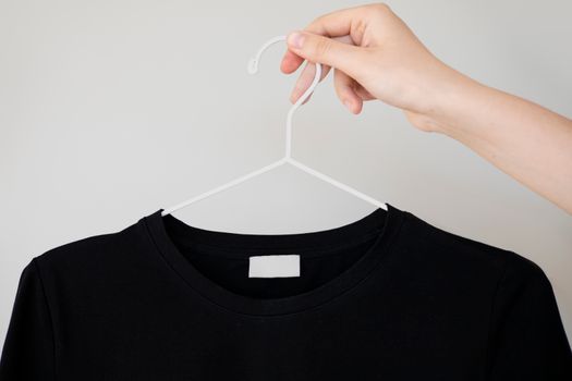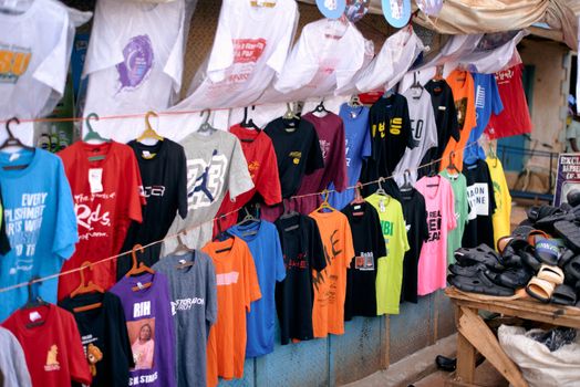
Typography is one of the most powerful visual tools in a designer’s toolkit—especially when it comes to t-shirt design. More than just a way to display a catchy slogan or a brand name, the creative use of type can set the tone, convey meaning, and turn a simple tee into a wearable work of art. With t-shirt sales projected to exceed $10 billion globally in 2025, standing out in this crowded market requires more than unique graphics alone; mastering the art of typography is essential for designers, entrepreneurs, and anyone looking to create impactful apparel.
In this article, we’ll dive into how typography can elevate t-shirt design, exploring key principles, popular styles, psychological effects, technical considerations, and real-world examples that prove the power of great type. Whether you’re a professional designer or just starting your t-shirt venture, understanding how to use typography effectively can help your designs resonate, sell, and stand the test of time.
The Power of Typography in T-Shirt Design
Typography is far more than the choice of font—it’s the deliberate arrangement, style, and interaction of text to communicate a message visually and emotionally. On t-shirts, where space is limited and the viewer’s attention fleeting, type becomes the hero or the villain of the design.
According to a 2021 survey by Printful, over 60% of best-selling t-shirt designs feature text as the primary design element. This statistic highlights how, when done right, typography can be the single most compelling component of a shirt. Effective typography can:
- Instantly communicate the shirt’s message or mood - Reinforce brand identity or personal expression - Enhance readability from a distance (critical for t-shirts) - Influence purchasing decisions through visual appealBut what makes typography on t-shirts truly effective? It’s a careful balance of creativity and clarity—an art and a science.
Key Principles for Impactful T-Shirt Typography
To make typography work on t-shirts, a few foundational principles are vital. These ensure your message isn’t lost in translation, whether viewed up close or across a crowded room.
1. $1 A t-shirt is a moving canvas. If your type isn’t easy to read at a glance, the message is lost. Choose typefaces with clear character shapes, avoid excessive ornamentation, and consider how the type will print on fabric. For example, sans-serif fonts like Helvetica and Futura are popular for their clarity, while script fonts work best for short, bold statements. 2. $1 Not all words are created equal. Use scale, weight, color, and spacing to highlight the most important parts of your message. For example, “SAVE THE PLANET” might have ‘SAVE’ in large, bold letters, with ‘THE PLANET’ smaller underneath. 3. $1 A well-balanced layout feels intentional and professional. Experiment with centered, left, or right alignment, and use negative space to avoid a cluttered look. Symmetrical layouts tend to feel more classic, while asymmetrical arrangements can be dynamic and modern. 4. $1 High contrast between text and shirt color improves readability. According to a 2022 study by Custom Ink, shirts with black or white text on contrasting backgrounds consistently outsell low-contrast combinations. 5. $1 Consider how the design will look on different shirt sizes and styles. Oversized type may overwhelm a small tee, while tiny text can disappear on larger sizes. Mock up your design at various scales before finalizing.Popular Typography Styles in T-Shirt Design
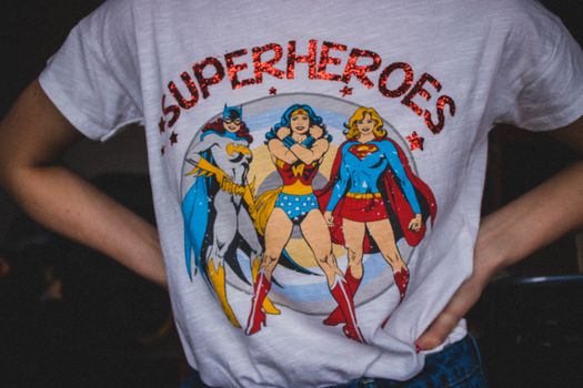
Trends in t-shirt typography evolve, but certain styles have enduring appeal. Here’s a look at some of the most effective and popular approaches, along with their typical use cases:
| Typography Style | Characteristics | Best For | Example |
|---|---|---|---|
| Bold Sans-Serif | Clean, modern, highly legible | Slogans, brand names, activism | “JUST DO IT” (Nike) |
| Vintage Script | Handwritten, retro, flowing lines | Inspirational quotes, nostalgia, boutique brands | “Good Vibes Only” |
| Distressed/Grunge | Textured, weathered, edgy | Music bands, streetwear, alternative culture | Band t-shirts (The Rolling Stones) |
| Minimalist | Simple, lots of negative space | High fashion, luxury, subtle statements | “humble.” (lowercase, small text) |
| Custom Lettering | Hand-drawn, unique shapes | Art tees, exclusive drops, personal brands | Illustrator collaborations |
An effective t-shirt brand often mixes and matches these styles, adapting to their audience and message.
The Psychology of Typeface Choices
Every font has a personality, and these subtle cues can powerfully influence how a t-shirt is perceived. A 2020 MIT study found that font choice can affect trust and emotional response as much as color or imagery.
For example: - Serif fonts (like Times New Roman) evoke tradition, stability, and reliability—making them ideal for collegiate or heritage-themed shirts. - Sans-serif fonts feel modern, approachable, and straightforward, perfect for tech, activism, or streetwear. - Script fonts suggest creativity, elegance, or playfulness, ideal for artistic or inspirational designs. - Display fonts, with their unique forms, can express rebellion, whimsy, or high energy—great for music or youth culture.Understanding your audience is key. A shirt aimed at environmental activists may use bold, blocky type to convey urgency, while a fashion-forward brand might opt for minimalist, lowercase text to suggest sophistication.
Technical Considerations for Printing Typographic Designs
Typography doesn’t just need to look good on screen—it must also translate well onto fabric. Here are crucial technical factors to ensure your type pops on the final product:
- $1 Avoid fonts smaller than 12pt for body text; larger is often better for headlines. - $1 Thin lines may disappear or crack with washing. A minimum line thickness of 1.5mm is generally recommended for screen printing. - $1 Crowded letters can bleed into each other when printed. Adjust kerning and tracking to allow for fabric movement and ink spread. - $1 Keep in mind color shifts due to shirt material and ink type. Always check a Pantone color bridge to see how your color will print. - $1 Convert all text to outlines/paths to prevent font substitution errors during printing. - $1 Screen printing, DTG (direct-to-garment), and heat transfer each have different limitations and advantages for fine type. For instance, DTG handles gradients and fine details better but may not be as durable as screen printing for bold type.A 2023 report from Printify notes that 70% of customer complaints about typographic tees relate to poor readability or fading text, underlining the importance of attention to these technical details.
Case Studies: Typography-Driven T-Shirt Success Stories
Some of the world’s most iconic t-shirts are successful because of their typographic choices. Consider these real-world examples:
- $1 Designed by Milton Glaser in 1977, this shirt uses a simple, bold slab serif font and a red heart symbol. Its clarity and universal message have made it one of the best-selling tees of all time, generating over $30 million in annual sales for New York State. - $1 Originally a British World War II poster, the phrase's clean, centered sans-serif type exploded in popularity on t-shirts in the 2010s. Its massive sales (over 5 million shirts sold worldwide) are due to its instantly recognizable, legible, and adaptable typography. - $1 Supreme's iconic red box logo uses Futura Heavy Oblique, a bold sans-serif font. The simplicity and assertiveness of the type have helped Supreme become a $1 billion streetwear empire.These examples prove that with the right typeface, layout, and message, typography alone can carry a design to global recognition.
Designing for Trends vs. Timelessness in Typography
T-shirt typography is subject to trends—think of the explosion of retro 70s fonts in recent years, or the minimalist craze of the 2010s—but balancing trendiness with timelessness is crucial for lasting success.
To create a typographic t-shirt that endures: - Limit the use of highly decorative or “of the moment” fonts for main messaging. - Focus on strong, clear type that works across styles and seasons. - Use trendy styles for limited drops or “event” shirts to capitalize on current demand. - Test designs with audiences before large production runs.A 2022 YouGov poll found that 52% of consumers prefer shirts with simple, classic typography over trendy or overly stylized fonts, especially when giving shirts as gifts.
Final Thoughts: Making Your Mark with Typography
Typography is the unsung hero of great t-shirt design. It shapes how your message is seen, felt, and remembered. By understanding the principles of legibility, hierarchy, balance, and contrast, and by choosing typefaces that match your brand and message, you can turn simple words into a statement that’s both stylish and saleable.
As t-shirt competition intensifies and buyers grow more design-savvy, those who invest in thoughtful, effective typography will be best positioned to stand out—whether designing for fun, for profit, or for a global movement.