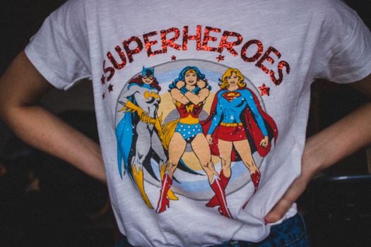
Every year, thousands of new t-shirt designs hit the market, but not all of them are created equal. While a handful become best-sellers, many fall short, not because the idea was flawed, but because of avoidable design mistakes. Whether you’re a seasoned designer, a small business owner, or an enthusiastic hobbyist, understanding the most common pitfalls in t-shirt design can save you time, money, and disappointment. Let’s dive deep into the 5 most frequent mistakes in t-shirt creation—and, most importantly, how to avoid them for stunning, sale-ready results.
The Cost of Mistakes: Why T-Shirt Design Quality Matters
T-shirts are more than just clothing—they’re a powerful medium for self-expression, branding, and even movements. In 2023 alone, the global custom t-shirt printing market reached an estimated $4.3 billion, with projections showing continued growth through 2028. But in this crowded space, quality stands out. Research shows that 62% of customers are less likely to buy from a brand again if the print quality or design is disappointing.
Design errors don’t just lead to unsold inventory; they can also damage your reputation. Printed t-shirts are shared in social posts, worn at events, and often given as gifts. A single poor design can reach hundreds of eyes and send the wrong message about your standards. Investing in excellent design—and avoiding the most common mistakes—is crucial for anyone serious about t-shirt success.
Mistake #1: Overcomplicating Your Design
One of the biggest traps for both new and experienced designers is trying to fit too much onto a single t-shirt. While it’s tempting to showcase every idea or element, cluttered designs rarely translate well to fabric. Unlike posters or digital graphics, t-shirts are worn on moving bodies and viewed from a distance, meaning simple, bold designs are most effective.
A study by Printful found that t-shirts with fewer than three design elements (such as text, icons, or images) sold 40% better than more complex prints. Overly busy designs can be hard to decipher and often lose impact after washing or with wear. Simplicity isn’t just aesthetically pleasing—it’s practical.
How to avoid this mistake: - Limit your color palette to 2-4 colors for clarity and printing efficiency. - Focus on one central message or visual. - Use negative space to let your design breathe. - Test your design at various sizes to ensure it remains legible and striking.Mistake #2: Ignoring Print Placement and Size
Where and how large your design appears on a t-shirt can make or break its appeal. Even the best artwork can look awkward or unflattering if it’s positioned poorly. Common issues include prints that are too high, too low, off-center, or excessively large or small.
According to a customer survey by Custom Ink, 71% of buyers listed "awkward print placement" as a major turn-off. The most popular placement is the classic chest print, typically centered and positioned 2-3 inches below the collar.
Below is a comparison table of popular print placements and their typical use-cases:
| Placement | Recommended Size (inches) | Best For | Potential Pitfalls |
|---|---|---|---|
| Center Chest | 9-12” wide | Logos, main graphics | Too high/low looks awkward |
| Left Chest | 3-4” wide | Small logos, emblems | Easy to misalign |
| Full Front | 12” wide x 14” tall | Bold statements, art prints | May overwhelm small shirts |
| Back Print | 12” wide x 14” tall | Team names, event shirts | Can feel heavy or stiff |
Mistake #3: Poor Font Choices and Readability
Typography is a powerful tool—but only if it’s used wisely. Choosing the wrong fonts, mixing too many styles, or not considering legibility can quickly ruin an otherwise great shirt. In fact, a 2021 T-shirt design survey revealed that 59% of buyers value "easy to read" messages as their top design preference.
Common font mistakes include: - Using decorative or script fonts that are hard to read at a glance. - Selecting fonts too thin or light, which can fade or break after washing. - Placing text on busy or low-contrast backgrounds. How to avoid this mistake: - Use bold, sans-serif fonts for main messages. - Limit your design to one or two font styles for cohesion. - Always check contrast between text and background; high contrast ensures readability. - Print out your design at actual size to test legibility from a distance.Mistake #4: Neglecting Fabric and Printing Method Compatibility
Not all t-shirt fabrics and printing methods are created equal, and mismatching them can lead to disaster. For example, a detailed photo print might look great on a polyester blend with sublimation but perform poorly on a textured cotton shirt with screen printing. About 35% of print failures are linked to using the wrong technique for the chosen material.
Key considerations: - 100% cotton is great for screen printing, offering bold colors and durability. - Blends (cotton/polyester) work well with both screen printing and direct-to-garment (DTG) techniques. - Sublimation printing requires polyester-rich fabrics for vibrant, long-lasting results. How to avoid this mistake: - Decide on your printing method before finalizing your design. - Consult your printer or manufacturer about best fabric-print combinations. - Order test prints on your chosen shirts to check for color accuracy, feel, and durability.Mistake #5: Forgetting the End User and Market Trends
It's easy to fall in love with your own creative vision, but ultimately, your design needs to resonate with your target audience. Designing in a vacuum or ignoring current trends can result in shirts that simply don’t sell. In 2022, Google Trends reported a 28% year-over-year increase in searches for "minimalist t-shirt designs," indicating a clear shift in consumer preferences.
How to avoid this mistake: - Research your audience’s demographics, interests, and style preferences. - Keep an eye on best-selling shirts on platforms like Etsy, Redbubble, and Amazon. - Avoid outdated memes, overused slogans, and clichés unless you’re deliberately going for retro appeal. - Seek feedback from your community or social media followers before finalizing designs.Final Tips for Flawless T-Shirt Design
Great t-shirt design is both an art and a science. By avoiding these five common mistakes—overcomplicating visuals, poor placement, unreadable fonts, material mismatches, and ignoring your audience—you position yourself for success in a competitive market. Remember, every t-shirt you release represents your brand and creativity to the world. Careful planning, attention to feedback, and a willingness to iterate can turn good designs into best-sellers.
Whether you’re printing for fun, fundraising, or building a business, take time to review your work against these guidelines. The extra effort is worth it—both for your reputation and your bottom line.